Overview
Iris is a patient support platform for people living with cancer. Members connect with a 24/7 care team of oncology nurses, therapists, and dietitians. Despite its value, adoption and engagement were lower than expected. My challenge was to redesign the care plan experience so members could understand what Iris offered, feel supported, and engage more consistently.
Role: Lead UX Designer
Timeline: 8 weeks
Deliverables: User research, Journey map, UI design, Figma prototypes
Problem
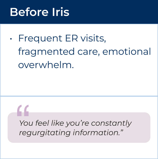
Members enrolled in Iris but weren’t actively engaging with the care team or resources. This meant missed opportunities for proactive support, unnecessary ER visits, and frustration for members who felt uncertain about what Iris could do for them.
Opportunities
There is an opportunity to investigate member adoption issues and identify potential product and service enhancements to better serve our members. How might we help members quickly understand the value of Iris, access the right support at the right time, and stay engaged with their care plan?
Processes & Methods
To explore this problem, I
● Conducted five one-hour interviews with members and a caregiver,
● Synthesized findings into personas and a journey map,
● Identified UX opportunities,
● Designed and tested improved flows.
User Interviews
Who I spoke to:
● 5 active members at different stages of treatment
● Mix of high- and standard-risk members
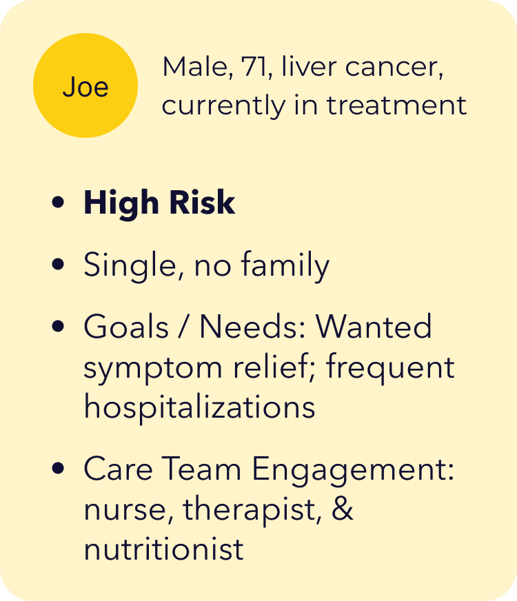
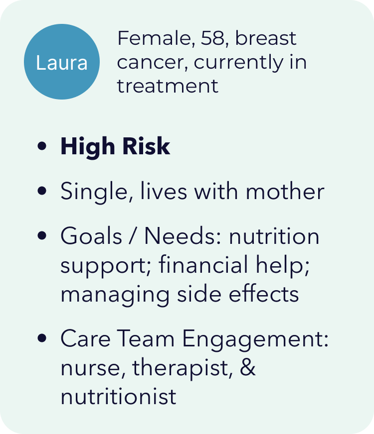
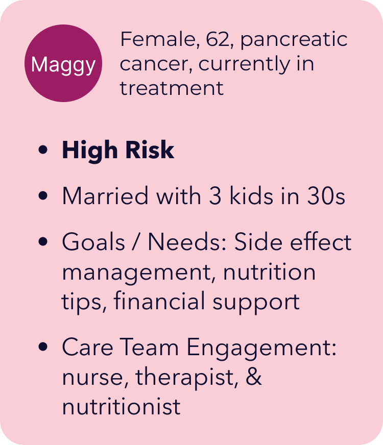
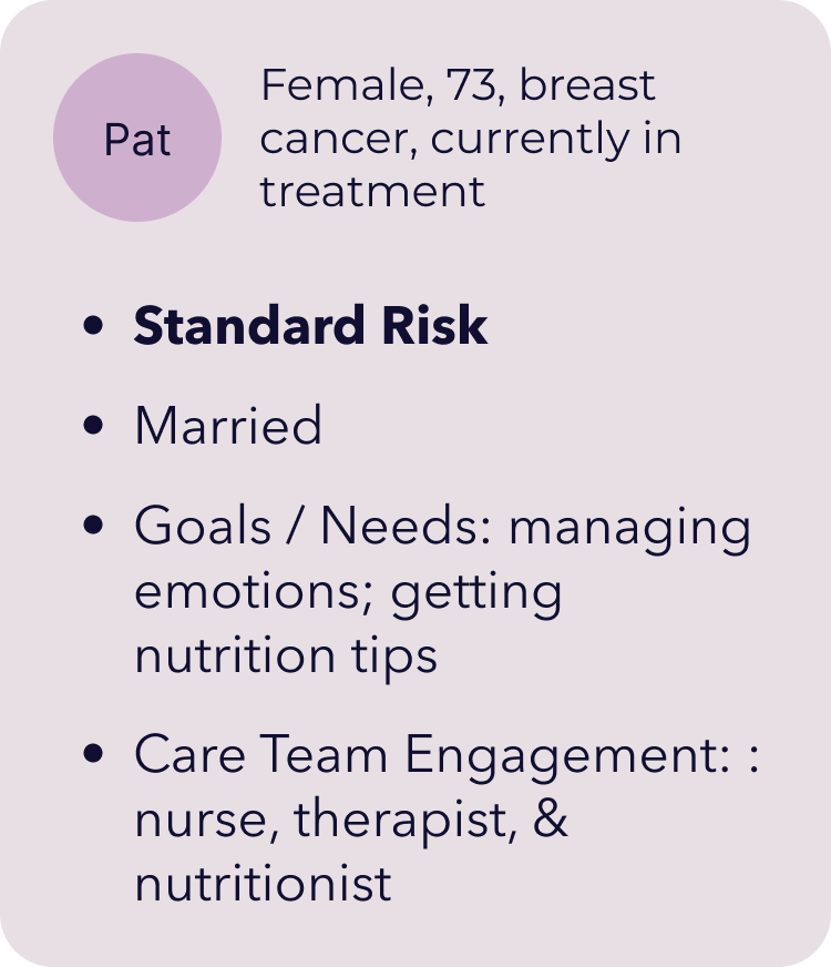
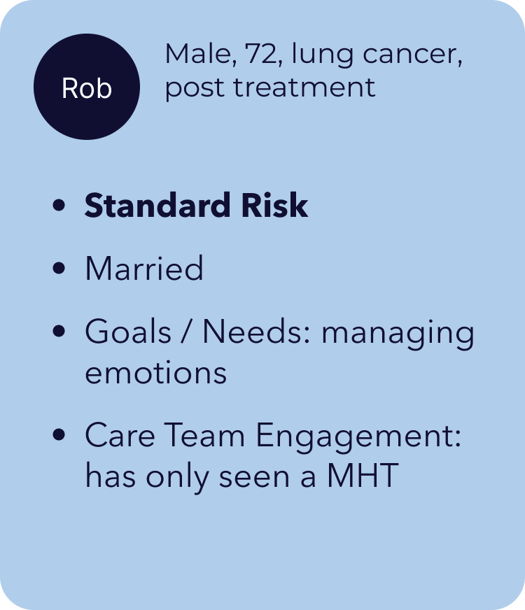
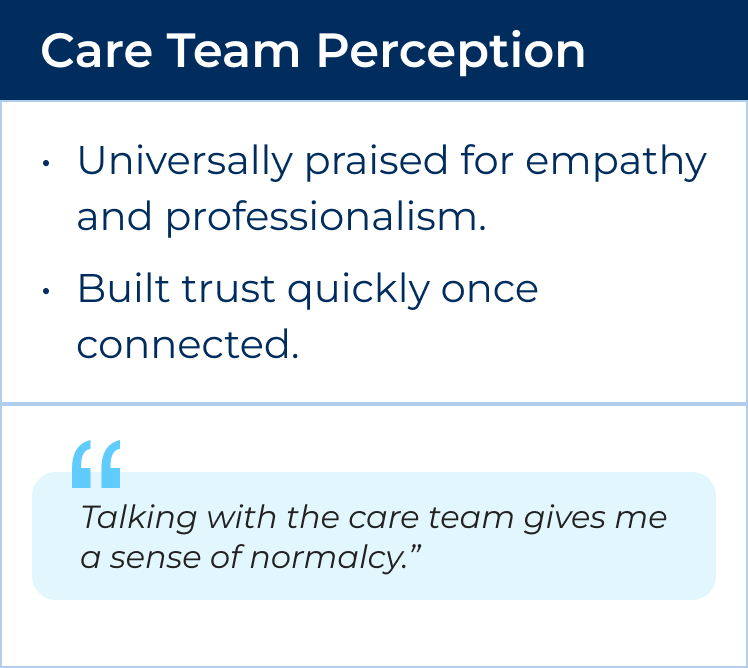
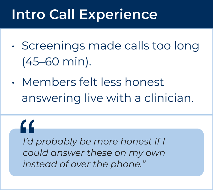
Key Themes Uncovered:

Baseline Data: Where Engagement Broke Down
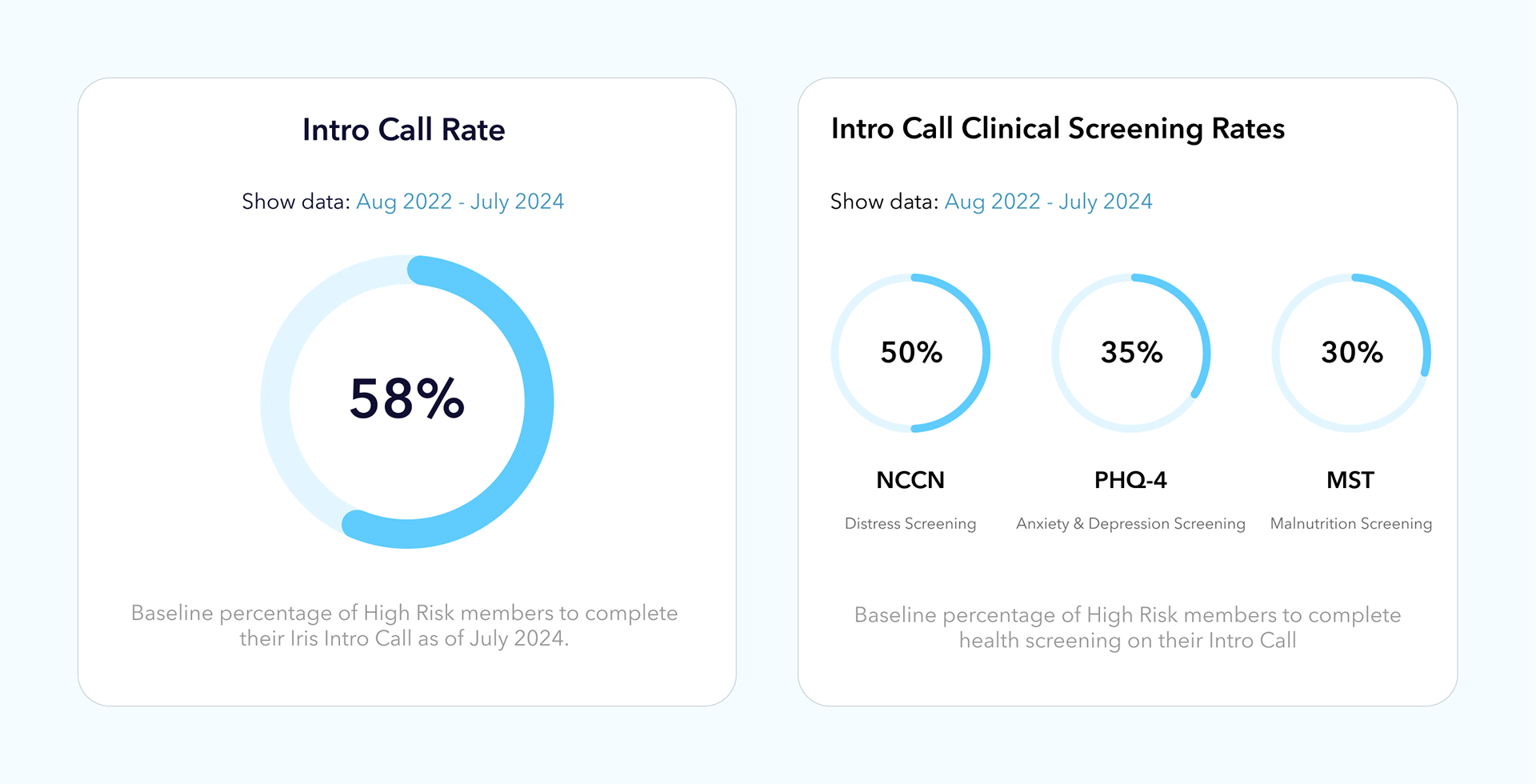
I analyzed platform data from August 2022 – July 2024 to understand where members were disengaging. The numbers validated what we heard in interviews: members were enrolling, but many weren’t completing core activities that connected them to care.
Intro Call Completion: Only 58% of high-risk members scheduled an Intro Call after enrollment.
Screenings: Fewer than half completed all required health screenings during the Intro Call (50% disease, 35% anxiety, 30% symptom tracking).
Therapy & Nutrition Engagement: Just 18% engaged with a therapist and 20% with a nutritionist after enrollment.
Content Engagement: Long-form articles saw steep drop-offs after the first week.
These numbers revealed that members needed clearer guidance, simplified onboarding, and more accessible, bite-sized ways to engage.

Mapping the Insights
To better understand where engagement broke down, I mapped the end-to-end member journey across clinical, marketing, and product touchpoints.
The journey map revealed:
Drop-off points: The steepest declines came after the Intro Call and during referral follow-up.
Emotional burden: Members moved from hopeful to ambivalent to tired as they navigated screenings and content.
Channel misalignment: Duplicate or irrelevant notifications created noise instead of support.
Missed opportunities: Members often didn’t connect with therapy or nutrition services, even when these were selected as goals.
These insights validated our baseline data and clarified where design changes could reduce friction, build trust, and sustain engagement.

Key Pain Points Identified
Mapping the journey across all touchpoints revealed four recurring pain points that created barriers to engagement:
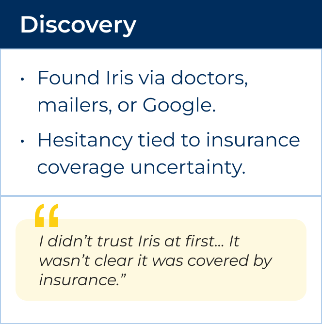
Hesitancy to schedule Intro Call
Some members were unsure clinical calls were covered by their insurance.
Overwhelming Intro Calls
Screening-heavy calls stretched 45–60 minutes, leaving members fatigued and producing incomplete data.
Low Uptake of Therapy & Nutrition Services
Despite being top member goals, fewer than 1 in 5 high-risk members followed through on therapy or nutrition referrals.
Content fatigue
Long articles felt inaccessible when members were exhausted. Members preferred short, activity-based modules or videos.
These themes became the foundation for defining UX opportunities and informed every design decision that followed.
UX Opportunities
The primary design updates fell into the following objectives:


Design Interventions
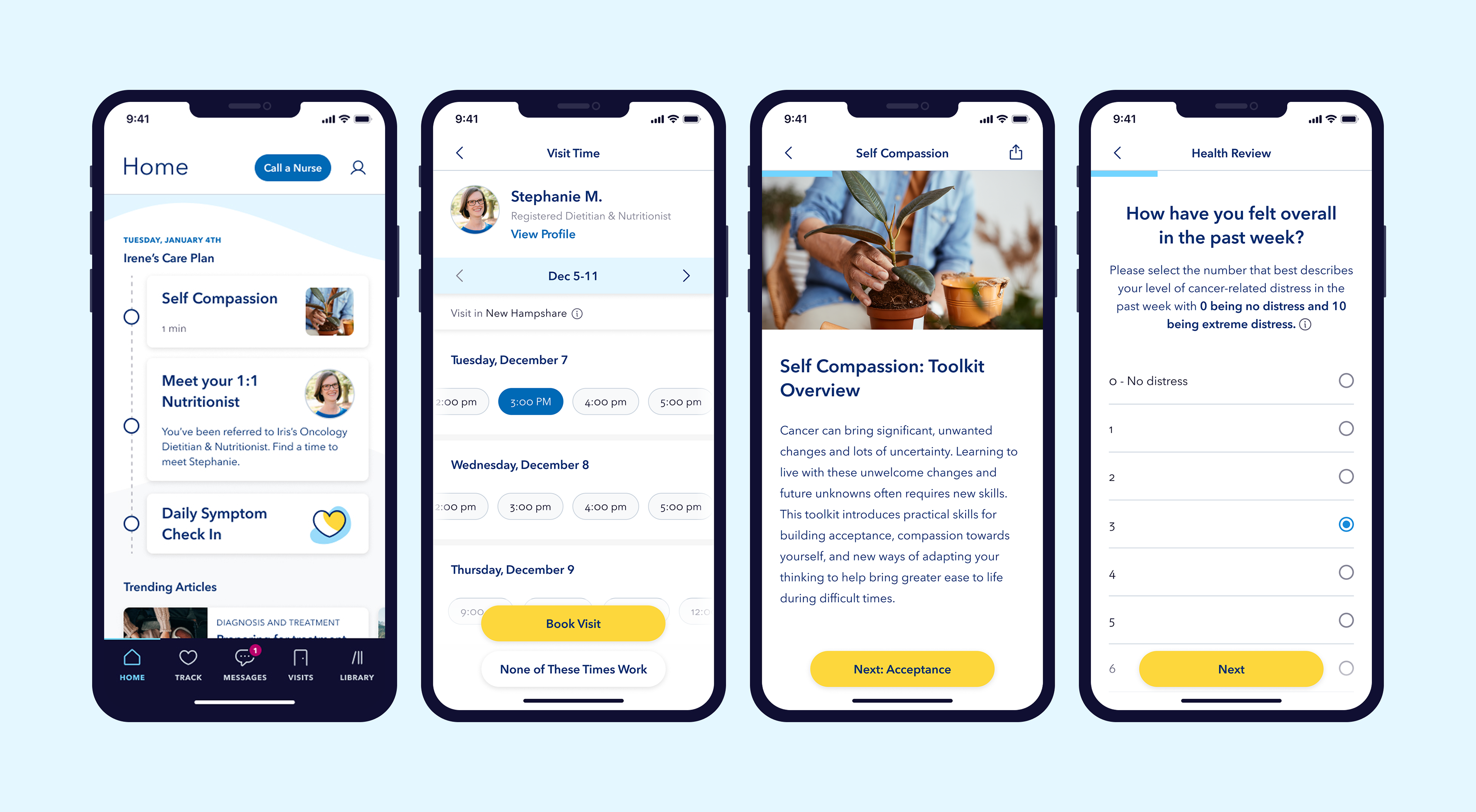
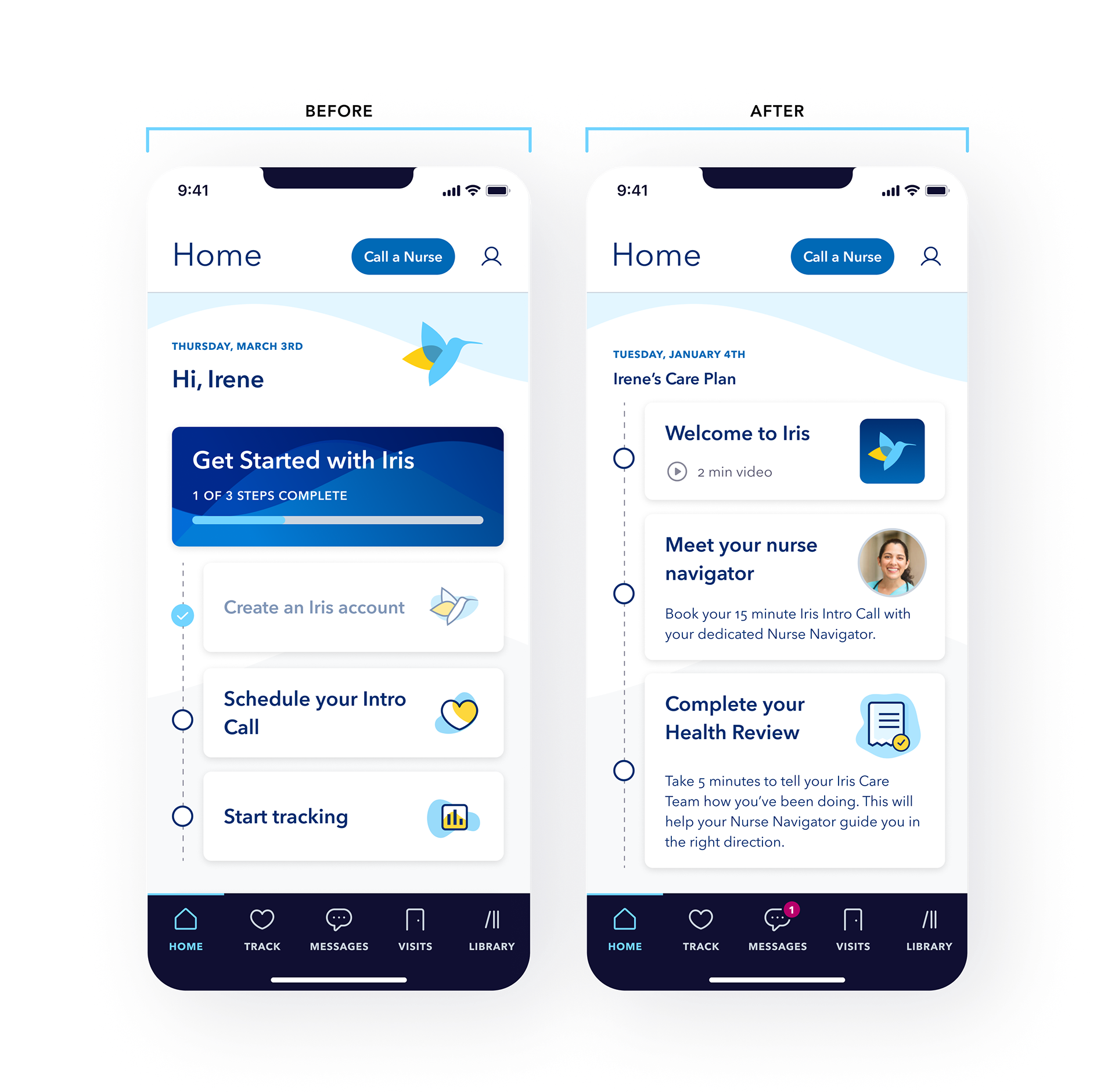
1. Automatic Nurse Assignment
Members were previously responsible for assigning their own Nurse Navigator, which created confusion and contributed to the misunderstanding that clinical visits were not covered by insurance. By changing language in onboarding and assigning a nurse immediately, there was an immediate point of contact to guide the member and reinforce insurance coverage.
I redesigned the "Get Started with Iris" check list into a Care Plan with tasks that clinicians could add content or guided actions to. We set it up so that the first three tasks were defaulted, but the clinicians could update and provide relevant content or tasks for the member.
3. Digitized Screenings
All screenings were originally completed live during the Intro Call, stretching the call to 45–60 minutes. We leveraged an existing form design in our CMS (Contentful) to digitize the screening flow, so that members could answer the questions on own and get more out of the Iris Intro call.
All screenings were originally completed live during the Intro Call, stretching the call to 45–60 minutes. We leveraged an existing form design in our CMS (Contentful) to digitize the screening flow, so that members could answer the questions on own and get more out of the Iris Intro call.
4. Guided Service Referrals
Instead of relying on members to seek out therapy or nutrition support on their own, we integrated referral tasks directly into the checklist and added structured follow-up messages from the nurse. This removed decision fatigue and made scheduling easier.
Instead of relying on members to seek out therapy or nutrition support on their own, we integrated referral tasks directly into the checklist and added structured follow-up messages from the nurse. This removed decision fatigue and made scheduling easier.

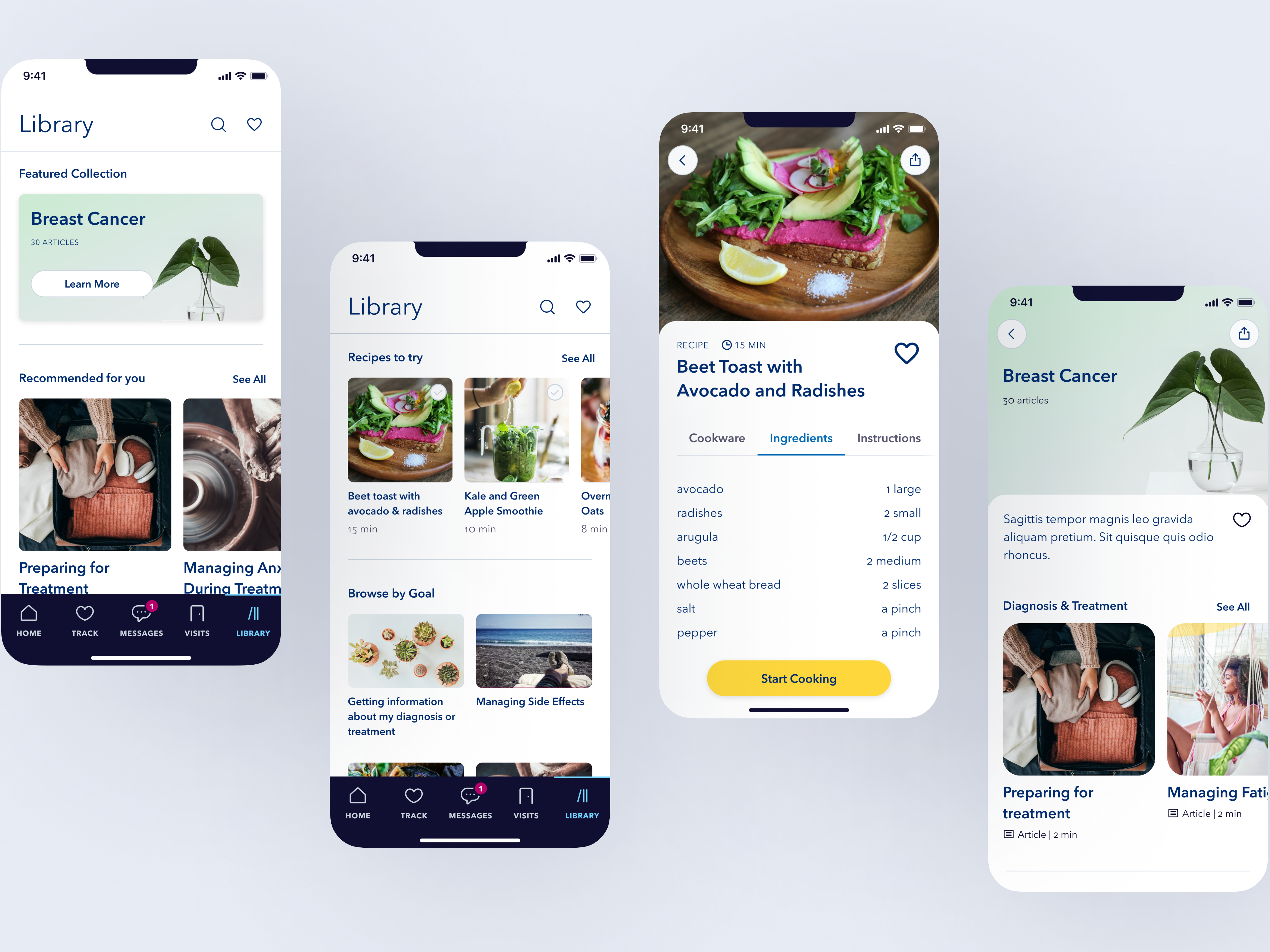
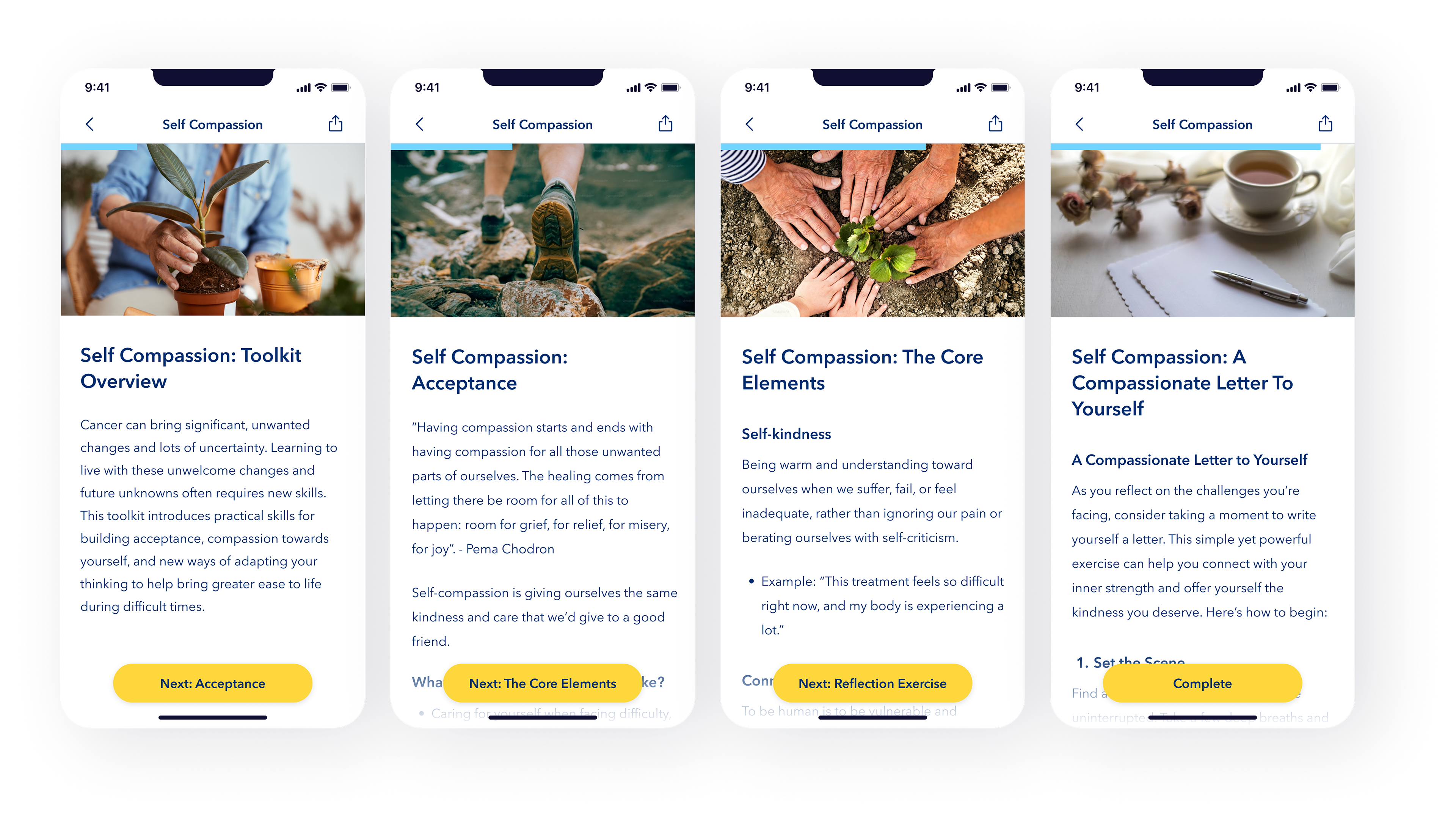
5. Content Modules
Long-form articles were broken down into bite-sized “content modules” designed to be completed in minutes. These were activity-based, focused on coping strategies and practical tips, and could be assigned dynamically by clinicians. Members reported these felt more useful and achievable than dense, text-heavy articles.
Results
Reduced Intro Call length from 45–60 minutes to 15 minutes.
Increased Intro Call completion by +12%.
Increased screening completion by +22%.
Increased content engagement by 18%.
Improved ongoing retention as members had reasons to return daily, with clearer next steps and guided referrals.